Customizing the Scanner UI
Overview of the Barcode Scanning UI
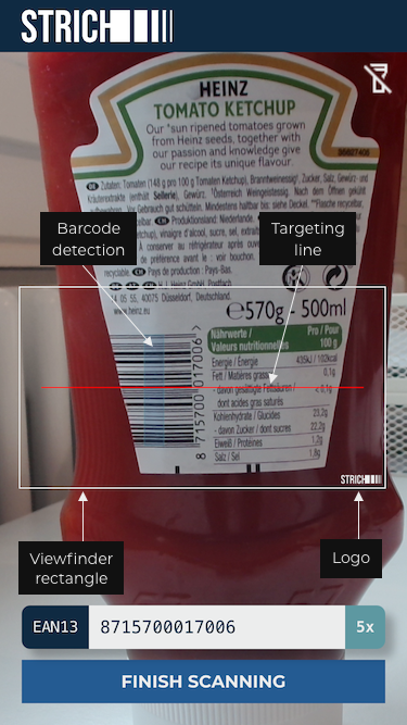
The screenshot below illustrates a full-screen barcode scanning UI. The area supplied by the host element is filled with the camera preview. Everything displayed on top of the camera preview is called the overlay.
The region of interest, where barcodes are detected, is delimited by a rectangular frame, called the viewfinder.

Styling Options
The viewfinder can be styled in the following ways:
Primary color: The color of the viewfinder rectangle and UI elements like the camera selector is set using the primaryColor property in the overlay configuration.
Corner radius: The corner radius of the viewfinder rectangle and the camera selector is set using the cornerRadius property in the overlay configuration.
Targeting line visibility: visibility of the targeting line can be toggled using the showTargetingLine property.
Targeting line active color: when a barcode is detected, the targeting line flashes briefly to a bright red. The color can be changed with the targetingLineActiveColor property.
Viewfinder border width: The border width of the viewfinder rectangle, using the viewfinderBorderWidth property.
Viewfinder corner radius: The corner radius of the viewfinder rectangle, using the viewfinderCornerRadius property.
Mask color: The color of the area outside of the viewfinder, using the maskColor property.
When a barcode is detected, and highlighting of detections is enabled (using the showDetections property), a rectangle is drawn at its location. Barcode detections can be styled in the following ways:
Fill color: The color used to fill the rectangle can be changed using the detectionFillColor property.
Border color: The color of the border surrounding the rectangle can be changed using the detectionBorderColor property.
Border width: The width of the border surrounding the rectangle can be changed using the detectionBorderWidth property.
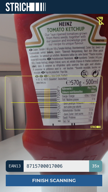
Example 1: Yellow primary color with rounded corners
The following configuration styles the UI using a yellow colors, applies rounded corners and sets the targeting line to be bright yellow in case of a detection.

Overlay configuration snippet
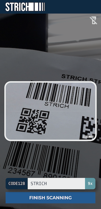
Example 2: Using a mask to emphasize the region of interest
The following configuration styles the UI using a near-white color and emphasizes the region of interest using a dark, semi-transparent mask color and a large border width for the viewfinder rectangle.

Overlay configuration snippet
Hiding or Replacing the STRICH Logo
Hiding or replacing the STRICH logo is an add-on capability available for Enterprise licenses. License keys that include the Custom Branding capability can be used to customize the logo appearance.
Hiding the logo: The built-in STRICH logo can be hidden by setting the customLogoSrc property to
null.Replacing the logo: A custom logo can be used by setting customLogoSrc property to a data URL of the logo image, or an absolute URL pointing to the logo image.
We recommend using a transparent SVG vector for the logo image.